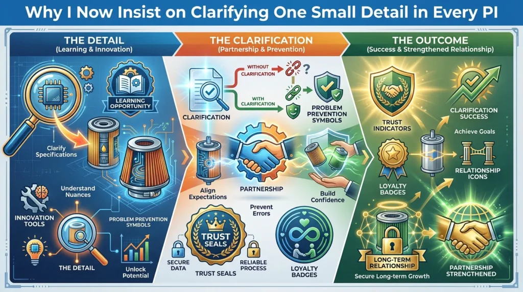
A few years ago, I learned the hard way that in international trade,
a “small detail” on the PI is never small.
We had a new customer who ordered several models of filters.
Everything looked perfectly clear:
- ✅ correct part numbers
- ✅ unit prices
- ✅ total amount
- ✅ delivery time
So we issued the proforma invoice (PI), he confirmed, and we started production.
When the shipment arrived, I received:
- a long email
- a lot of photos
- and one big problem:
“The filters are good, but the branding is wrong.”
The issue wasn’t about quality.
The issue was about expectation.
On the PI, we wrote only:
“Neutral packing / Customer design.”
In my mind, that meant:
In his mind, that meant:
- exact layout as his previous supplier
- logo position
- font size
- side panel information
- barcode location
- and other detailed design elements
Our artwork was “OK”,
but not exactly what his marketing team expected.
The result:
- 📦 his team had to re‑sticker part of the cartons
- ⏳ goods stayed longer in his warehouse before selling
- 😣 the first order started with unnecessary frustration
Nobody intentionally did anything wrong.
But we both made the same mistake:
We allowed one vague line on the PI to carry too much meaning.
After that order, I changed my process completely.
Now, for every PI involving branding or packing,
I insist on clarifying one “small” detail that isn’t small at all.
This article explains:
- what went wrong
- how vague words on a PI create expensive problems
- how we redesigned our process
- and how buyers and suppliers can protect themselves with better PI clarity
The Order That Looked “Perfect” on Paper
From a traditional trade perspective, that order looked smooth:
- multiple filter models
- agreed prices
- clear quantity and delivery terms
- PI checked and confirmed
On the PI, we had all the normal items:
- buyer details
- seller details
- product list
- total value
- incoterms
- delivery time
The only brief line related to packaging and branding read:
“Neutral packing / Customer design”
We had his logo file.
We had his brand colors.
We had basic instructions like:
- “Use this logo.”
- “These two colors are our main colors.”
So we went ahead and:
- created carton artwork
- designed the layout
- placed brand elements in a way we believed was professional
From our side, the job seemed well done.
From his side, the expectation was something else.
The PI didn’t capture that difference.
And that’s where the trouble started.
What “Customer Design” Meant to Me vs. to Him
The core problem was hidden inside three words:
“Customer design packing.”
To us, this meant:
- use the customer’s logo
- follow the customer’s colors
- make a clean, professional layout based on our experience
To him, it meant:
- exact replication of his previous supplier’s layout
- same logo placement
- same font sizes
- same side panel information
- same barcode position
- same label style and positioning
He was expecting:
- continuity of brand image, not just use of logo and color
But those expectations were never explicitly written in the PI.
They were sitting in his mind and in our assumptions.
The artwork we printed was:
- technically correct
- visually consistent with his brand identity
- but not identical to what his marketing team had in their brand guidelines or previous packaging
So when the goods arrived, his reaction wasn’t:
It was:
For many importers and distributors,
brand presentation is almost as important as product performance.
The Real Impact of One Unclear Line on a Proforma Invoice
The consequences of that small misunderstanding were very real.
3.1 Extra Work for the Customer
Because the branding wasn’t exactly what they wanted, their team had to:
- print additional stickers
- re‑label a portion of the cartons
- adjust packaging in their own warehouse
That meant:
- extra labor cost
- additional material cost
- time spent on rework instead of selling
3.2 Delayed Time to Market
While they were adjusting the packaging:
- the goods stayed longer in the warehouse
- sales got delayed
- some customers probably had to wait longer for stock
For time‑sensitive markets, this matters.
3.3 Frustration from the First Order
First orders are important.
They set the tone for the relationship.
Instead of starting with:
- “Wow, everything is exactly as expected.”
we started with:
- “We have a problem we must fix.”
Even though the filters themselves were good,
the customer’s first emotional impression was:
- “I now have a headache to solve because of this packing issue.”
This is not the kind of experience any supplier wants to create.
3.4 Responsibility Shared by Both Sides
Were we wrong?
Were they wrong?
In reality:
- our understanding was reasonable from our side
- their expectation was reasonable from their side
The real problem was here:
We both allowed a vague expression on the PI
to carry many unspoken assumptions.
How One Vague Line on a PI Creates Many Possible Interpretations
In international trade, short phrases like:
- “customer design”
- “neutral packing”
- “standard quality”
- “previous order as reference”
may feel convenient,
but they are very dangerous when not supported by clear attachments and confirmations.
For packaging and branding, “customer design” can mean:
- “Use our logo anywhere you feel appropriate.”
- “Follow our strict brand guideline exactly.”
- “Make it similar to previous supplier’s design.”
- “Use our layout file as is, no change.”
Unless you specify which one it means,
you are inviting misunderstanding.
In our case, the PI had everything clear about:
- part numbers
- prices
- quantities
But that one line about packing was too general.
The lesson is simple:
A PI is not just about numbers.
It’s a shared agreement of expectations.
Anywhere the expectation is vague, risk is high.
How We Changed Our Process After This Experience
After this incident,
I decided we could not leave packaging and branding expectations in a grey zone anymore.
We changed our process in three specific ways.
5.1 Always Attach Concrete Visual References
Now, for every order involving branding or custom packing,
we always attach:
- 📎 reference photos of previous orders (if any)
- 📎 a PDF of the carton layout with dimensions
- 📎 a sample of the label with all information visible
We make sure the customer can see:
- which side the logo is on
- how big it is
- what text appears on each panel
- where barcodes and model numbers are placed
- what languages and symbols are printed
We don’t rely on “customer design” as a general word.
We show the actual design.
5.2 Ask Explicitly for Final Design Confirmation
I now insist on confirming one “small” but critical thing:
“Please confirm: this attached artwork/photo is exactly what you want us to follow.”
We send:
- the final artwork file (version marked)
- photos or mockups if needed
We ask the customer or their marketing team to:
- check carefully
- add comments if needed
- give written confirmation (email is enough)
5.3 Make the PI Refer to the Exact Artwork Version
On the PI, instead of just writing:
- “customer design” or “neutral packing”,
we now write something like:
“Packing as per attached artwork v3.2 confirmed by Mr. X on [date].”
This links:
- the commercial document (PI)
- the specific artwork version
- the person and date of confirmation
This way:
- there is a clear reference for what “customer design” means
- both sides can go back and check exactly what was agreed
- arguments like “I thought…” become much less likely
Does This Create More Emails? Yes. Is It Worth It? Absolutely.
You might think:
- “But this sounds like more work.”
- “More emails. More back‑and‑forth.”
And it’s true.
Sometimes:
- the customer’s marketing team gets involved
- they add comments
- they ask to move a logo or adjust a font
- there are 1–2 extra rounds of artwork changes
But once we lock it, both sides are protected:
- we know exactly what to print
- the customer knows exactly what they will receive
- there is a solid reference if questions come later
From our experience, this extra communication at the beginning:
- saves far more time later
- avoids rework, complaints and stress
- makes first orders smoother and calmer
Most importantly,
new customers are often positively surprised by how careful we are with their brand.
Why Brand Presentation Matters So Much for Filter Buyers
In the aftermarket auto filter business,
many products can look similar technically:
- same dimensions
- similar specs
- similar performance
For importers, distributors and private label brands,
branding is where they differentiate.
Their brand image on the box communicates:
- quality positioning
- price segment
- professional look
- consistency with their other products
If the packaging:
- looks cheap
- looks inconsistent
- or doesn’t match their other stock
it can:
- weaken their brand
- confuse their existing customers
- make the product harder to sell
That’s why many buyers are extremely sensitive about:
- logo size and position
- color accuracy
- layout style
- side panel information
- barcodes and regulatory symbols
If you treat packaging as “just a box,”
you miss how important it is to them.
By taking packaging details seriously in the PI and confirmation process,
you show:
- respect for their brand
- understanding of their business
- commitment beyond just manufacturing a part
What Buyers and Suppliers Can Learn from This
8.1 If You Are a Buyer or Importer
When you place orders with your suppliers, especially for private label filters:
- do not assume “customer design” means “exactly like last time”
- always send your latest artwork files or clear photos of your current packaging
- ask the supplier to send their final artwork for approval before printing
- ask them to reference the artwork version on the PI
You can even add your own internal rule:
- “No PI is fully approved until packaging design is confirmed and attached.”
This simple discipline can:
- prevent branding surprises
- save rework and delay
- protect your brand consistency across suppliers
8.2 If You Are a Supplier
If you manufacture for other brands:
- never rely on vague words like “customer design” alone
- create a system for managing artwork versions
- keep email records of design approval
- reference artwork and photos clearly on PI and order confirmations
You can also:
- send sample photos or digital mockups early
- ask for clear confirmation from the person in charge of branding
- avoid printing until everything is locked and confirmed
Yes, it takes more steps.
But it reduces:
- arguments
- blame
- hidden costs
And it builds a reputation:
“This supplier takes our brand seriously.”
A PI Is Not Just a Price List – It’s a Shared Expectation Sheet
Many people see a PI mainly as:
But in real life, a PI is also:
- a mini contract
- a snapshot of what both sides expect
- the base reference when there’s a disagreement later
The most expensive mistakes in B2B often come from:
- the smallest unclear words
- assumptions not written anywhere
- “I thought you meant…”
By making your PI more explicit, especially on:
- packing
- branding
- labels
- documentation
you turn it into something much more powerful:
A shared, documented agreement of what “correct” looks like.
If You Want a Filter Supplier Who Protects Your Brand Details
Since we changed our process,
we’ve avoided many “but I thought…” moments around branding and packing.
Deliveries became smoother.
New customers often say:
- “You are more careful about our brand than some of our previous suppliers.”
If you want a filter supplier who:
- pays attention not only to part numbers and prices
- treats your packaging and branding with professional care
- uses PIs as clear expectation agreements
- sends artwork, photos and layout files for your confirmation
I’d be happy to discuss how we handle:
- private label filter projects
- brand consistency across different models
- packaging design and approvals
- documentation and PI clarity for new orders
📩 bruce.gong@belingparts.com
🌐 www.belingparts.com
In international trade,
clarifying one tiny detail today
can save weeks of headache after the container arrives.